The facade of a home is its face to the world. In architectural terms, it one of the prime design aspects – setting the tone and theme for the internal decor.
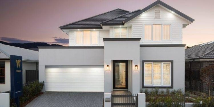
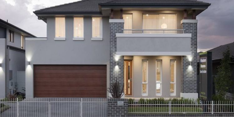
As can be appreciated in the Impression (above), the render highlights the entrance, making it a focal point. Depth, accent and interest are formed through the use of multiple tones, with the garage door acting as a dramatic counterpoint to the rest of the facade.
Rendering is a popular choice for modern homes but deciding which colour scheme to choose can be difficult. It is often hard to picture the desired outcome until the deed has been done and you have committed to living with your choice for a long time to come.
You must consider all aspects of your home’s facade, including:
- Bricks, stone and render
- Driveway textures, tones and colours
- Garage doors
- Windows
- Entrance doors
Lasting impressions
The internal palette and external colour scheme can pinpoint a building’s origins quite accurately. Think of the cream and orange brick homes of the sixties, the brown brick of the seventies or the heritage greens and reds of the late 90’s and early 2000’s.
To avoid dating your home prematurely by using colours and facades which identify it with a fashion trend specific to an era, use classic, neutral tones which will stand the test of time better than garish or strong hues.
Through the use of computerised graphics, is now possible to experiment with layering tones to help to visualise the final effect.

Set the tone
Colours should complement the overall impression you wish to convey to the world and represent your personal taste.
Work with the design of the home. As an example of this, the facade of the property above displays how a Hamptons style home, lends itself to coastal colours of soft greys and crisp whites – working with the design to create a classic yet stunning statement.
Muted grey tones work well with swimming pools as they contrast to good effect against the sparkling blue of the water.
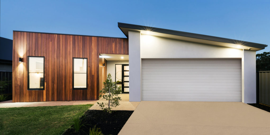
Exposed brick, stone or timber as seen in the property below, adds another level of warmth and rustic beauty to a facade.

Three-dimensional thinking
Often homeowners envisage their facade as being one solid colour but this can create a one dimensional or flat aspect to the home. Instead, look at the facade as:
- Base
- Middle
- Top
The main building will generally be a darker colour to indicate solidness and grounding. Focal points and architectural features such as balconies and trims can then be highlighted through the strategic use of complementary tones. Lighter tones can also be used to create depth and interest.
Flow
To create a theme throughout your home, use complementary colours, combining internal and external palettes. This will tie the ‘story’ of the home together, creating an all-encompassing flow – from the front gate through to the backyard.
Partnering with a trusted builder means you will have all the tools and cutting edge technology at your disposal, to make the best choices for your superb new facade.


